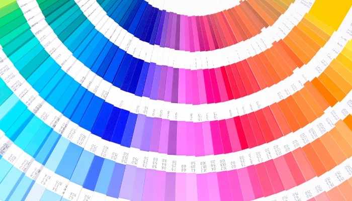
When it comes to designing a custom T-shirt, choosing the right color combinations and color codes is crucial to creating a cohesive, eye-catching design. Colors not only set the tone but also influence how your design is perceived, making it essential to select shades that complement each other and communicate effectively. Additionally, using specific color codes (like HEX, CMYK, or RGB) ensures that your design looks consistent both digitally and in print. Let’s dive into some essential guidelines for selecting color combinations and how to use color codes to bring your T-shirt design to life.
Add colour code and t shirt pic with men and women used avonem logo in t shirt and other designs also .

Why Color Combinations Matter in T-Shirt Design
The colors you choose can make or break your design. If the colors clash or lack sufficient contrast, your design may appear muddled or difficult to read. On the other hand, a well-thought-out color scheme brings your design to life and helps it stand out. By following a few basic principles, you can create a T-shirt that’s both visually appealing and aligned with your message or brand.
Guidelines for Color Combination and Codes
Understanding color theory can go a long way in helping you select the right color combinations. Here are three popular approaches to selecting colors that work well together:
1. Complementary Colors
Complementary colors are opposite each other on the color wheel, such as blue and orange, red and green, or yellow and purple. These combinations are vibrant and high-contrast, making them ideal if you want your design to pop. Complementary colors are particularly effective for bold T-shirt graphics, logos, and text that needs to stand out.
- Example: Pair a bright blue T-shirt background with an orange design to make the graphic elements appear more dynamic and eye-catching.
2. Monochromatic Schemes
A monochromatic scheme involves using variations of a single color. By adjusting the saturation and brightness of the base color, you can create a layered, textured look without overwhelming the design. Monochromatic schemes are great for achieving a sophisticated and minimalist aesthetic, offering depth while maintaining simplicity.
- Example: A dark navy blue T-shirt with lighter blue text or graphic elements provides a subtle, stylish look.
3. Analogous Colors
Analogous colors are located next to each other on the color wheel, such as blue, teal, and green or red, orange, and yellow. This approach offers a harmonious, blended look that’s less intense than complementary colors. Analogous schemes are excellent for designs with a natural or relaxed feel, as they create a smooth, unified appearance.
- Example: Use shades of green and teal for an earthy, organic vibe that’s easy on the eyes and perfect for casual or nature-themed T-shirts.

Common Color Code Formats: HEX, CMYK, and RG
When it comes to getting colors right for digital and print formats, it’s essential to understand the different color code formats and when to use them. These codes ensure that the colors on your screen match the final print result as closely as possible.
1. HEX Codes
HEX codes are a six-digit combination used in web design and digital graphics. They’re primarily used in digital spaces but can also be helpful for specifying colors when sending a design to print. HEX codes are ideal for consistency when previewing designs online.
- Examples:
- #FFFFFF for white
- #000000 for black
- #FF5733 for a vibrant orange
2. CMYK: Cyan, Magenta, Yellow, and Black
CMYK is the go-to color format for printing, as it allows for precise color mixing. Unlike RGB, which is used for screens, CMYK provides colors that closely match what you’ll see in physical prints, making it perfect for T-shirt design.
- Examples:
- C: 0, M: 100, Y: 100, K: 0 for a rich red
- C: 75, M: 68, Y: 67, K: 90 for black
- C: 0, M: 0, Y: 0, K: 0 for white
3. RGB: Red, Green, and Blue
RGB is the standard format for colors on digital screens. It’s best used for digital previews and web display, but should be converted to CMYK when preparing designs for print to avoid color discrepancies.
- Examples:
- RGB(0, 0, 0) for black
- RGB(255, 255, 255) for white
- RGB(255, 87, 51) for a bright orange

Tips for Getting T-Shirt Color Combinations and Codes Right
- Preview Colors on Your Chosen T-Shirt Base: When designing a T-shirt, consider the color of the shirt itself. Colors look different on different backgrounds, so always test your design on the T-shirt color you plan to use.
- Use Sufficient Contrast: For readability and visual clarity, ensure there is enough contrast between the text/graphic and the T-shirt color. For example, dark text on a dark T-shirt may not be readable, while white text on a dark background provides excellent contrast.
- Match Digital to Print Colors: If you’re designing online, make sure to convert RGB to CMYK when sending your design to print. This step helps reduce color discrepancies and ensures your design looks as vibrant on the T-shirt as it does on the screen.
- Use Pantone Colors for Brand Consistency: If you’re designing a T-shirt for a brand, consider using Pantone colors. These are standardized colors that ensure exact matching across all print mediums, ideal for brand logos or merchandise.
- Consider the Mood of Your Color Scheme: Different color schemes evoke different moods. For example, cool colors (blues and greens) can feel calming, while warm colors (reds and oranges) are more energetic. Choose colors that align with the message or vibe you want your T-shirt to convey.

Creating a Cohesive and Striking T-Shirt Design
Choosing the right color combinations and codes ensures that your custom T-shirt design is cohesive, vibrant, and perfectly suited to your vision. By understanding complementary, monochromatic, and analogous color schemes, you can craft a T-shirt that not only stands out but also feels harmonious. And with color codes like HEX, CMYK, and RGB, you can achieve consistent colors from screen to print.
Whether you’re designing for yourself, a brand, or an event, remember that color is one of the most powerful elements of design. With thoughtful choices and a bit of creativity, you can create a T-shirt that is as striking as it is meaningful.


